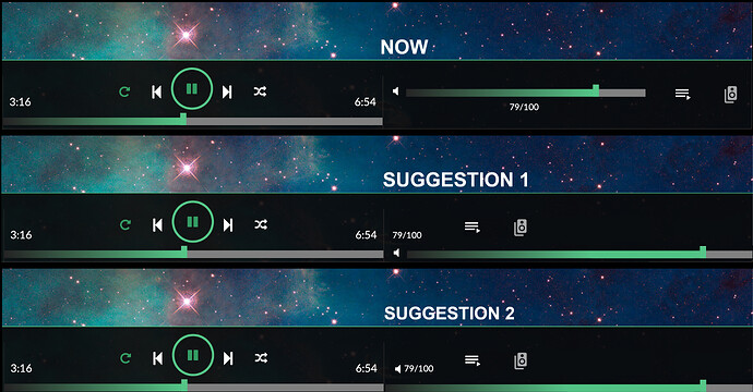
This thread will serve as feedbacks for the new Volumio3 Experimental User interface.
Let us know: what you don’t like, what does not work, what would you improve, what you think can be done differently, but also what you like!
Ciao Michelangelo,
first of all thanks for the update!
I just switched to the new UI and I noticed an issue. I can not access the settings menu from my laptop. The icon seems to have disappeared.
On my mobile (iPhone IOS 12) everything works fine and settings menu is accessible.
On my iPad (iOS 13 beta) icon is also missing.
I have settings now in menu on left. I do not know is it scrollable? I don’t have so many plugins installed.
First, I want to thank you for Volumio and MyVolumio, I’ve been using it for some months on Raspberry Pi3 and now 4, and it’s really good.
Now, regarding Volumio3:
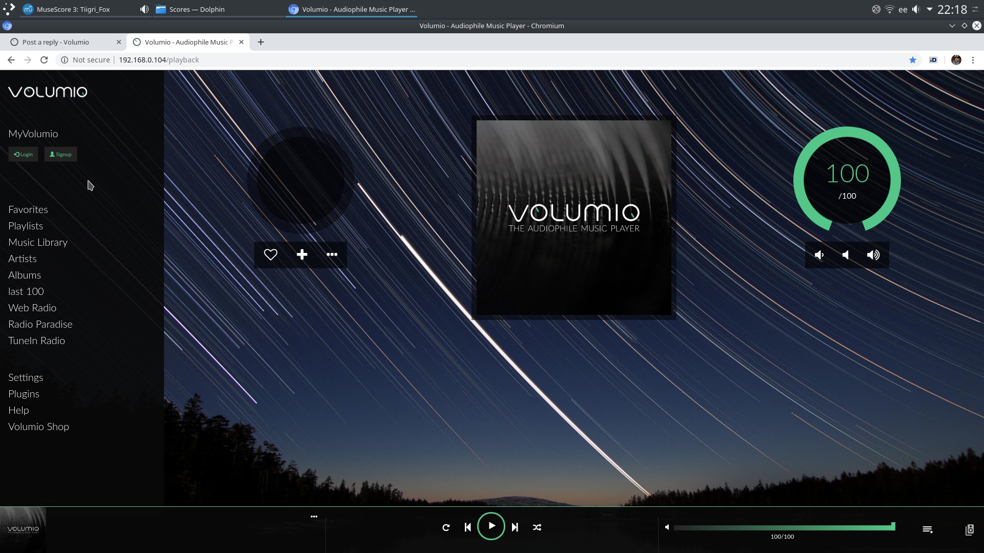
- the “old” play screen with the two circles are a “brand image” for me, and love it. It sets Volumio apart from every other player;
- It’s true that the new Volumio3 play bar in the bottom is pratical and works well, keeping the controls and info across all screens;
- The player screen on Volumio3 repeats some info in the bottom bar and on the main area of the screen; This leads to confusing and “bad design” in the play screen;
- Why not keep the bottom bar in all screens EXCEPT on the play screen, where the “old” and “true” Volumio look and feel could be the only interface, hiding the bottom bar player?
Apart from that, there are some minor issues that I’m sure will be taken care of in future updates. I like the left menu bar and the settings menu (would like to have the back button always present in the top of the screen so not to have to scroll all the way up everytime).
Hi;
I have just enabled it and main menu scrolling works only on Edge - no Firefox, no Safari, no IE, only Edge
So - “Settings”, with my screen resolution, is available only on Edge…
Regards
There are two “Help”: one on the left menu bar, another on the Settings menu.
On the Settings menu, “Help” opens the Volumio Documentation page. On the left menu bar, “Help” is dead.
And I would like to have the “Shutdown” button on the main menu. I could leave Raspberry Pi3 on for days without a worry, so not having a easy access “Shutdown” button was ok. But Raspberry Pi4 really gets hot and I prefer do shut it down at night and when I’m out for several hours, so a more direct button would be nice.
Regarding the bottom bar player, I don´t have the progress and volume bars on iPhone and Android tablet. So there is no way to change the volume or to skip to a certain part of a track (or am I missing something?).
On a PC browser all is well.
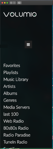
The Main Menu should have a scroll bar. With my screen settings, in Chrome, I don’t see the last lines.
As far as I know circular controls are nothing special to Volumio. I know that Runeaudio and moOde also are using circular controls. Volumio green color is more distinct to Volumio than controls. There is nothing wrong with circular controls 
I discovered one visual glitch: When viewing track context menu of single track album, then pop-up menu opens to wrong direction and some menu items are not visible. Example screenshot from volumio offical app.
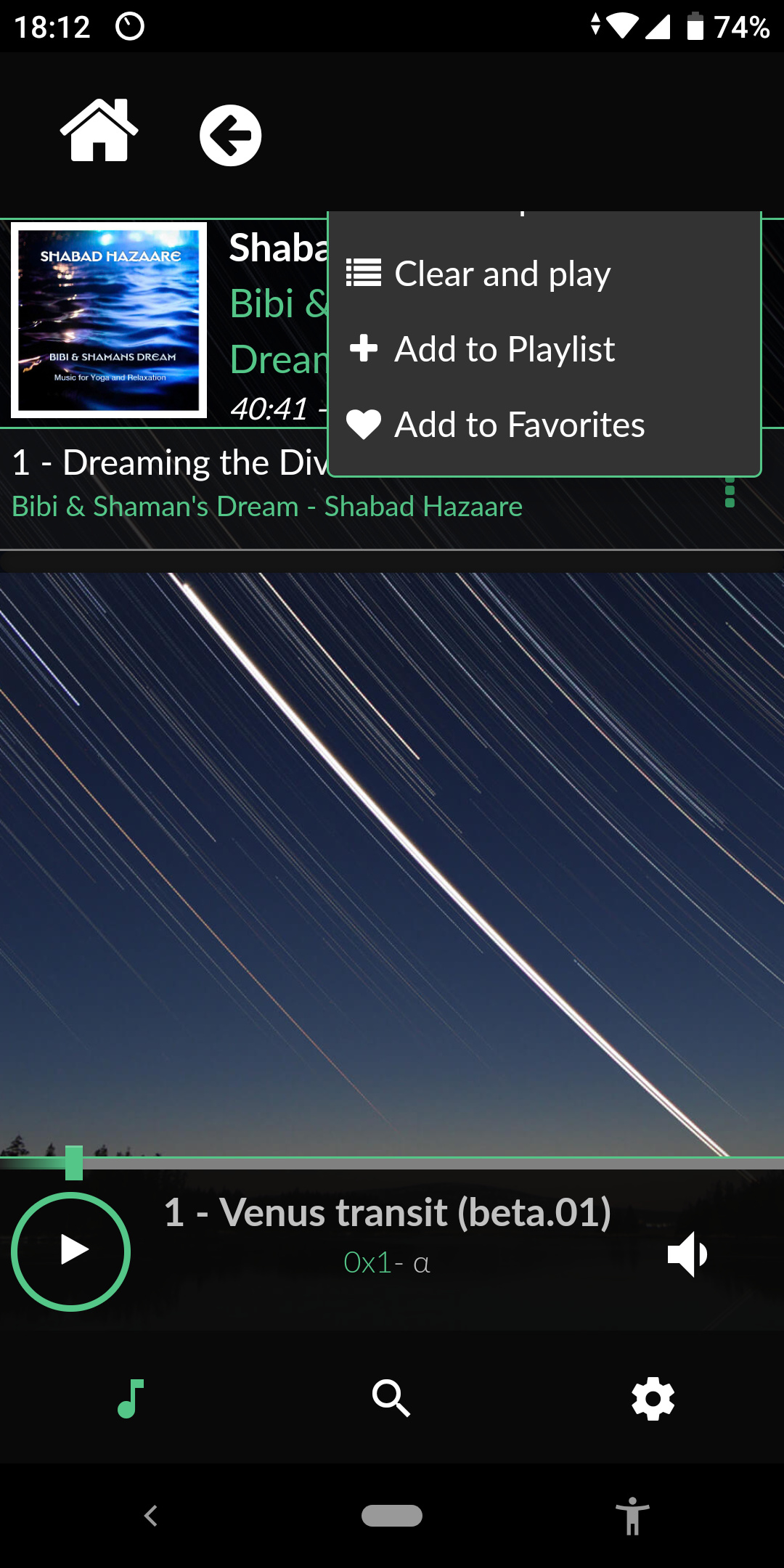
Probably some problem with z-index or margins.
Hi,
I am controlling the Volumio mainly via my TV’s web browser and the new UI doesn’t work in it. I have had no issues with the current UI with controls and views. In the new UI none of the buttons on the left side is not working (nothing happens when selecting something from the menu) and the Album Art is not visible on the background, also the controls like volume is missing. I have reset the browser/cleared the cache.
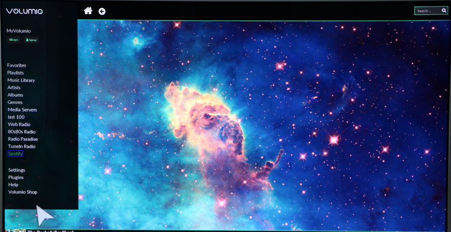
Also, I’d like to see the Album Art much bigger with less of controls, buttons and menus etc. Could there be a possibility for a separate view/window which shows the Album Art “full” depending on the screen/monitor/resolution with much less of information displayed at the same time, just to display the Album Art only, and nothing else.
If I change the browser view size on my browser, everything including the Album Art is bigger, and when using the Volumio3 UI, the menu on the left size goes broken. The last items in the menu goes hidden.
thanks for the update and the volumio 3 experimental UI
I have a problem with the new volumio3 UI and that the corners are not rounded up properly (the official volumio android app) the same applies to my official 7 inch touchscreen.
everything is ok on my mac on safari.
for the rest it all looks very nice and for now it all works great 

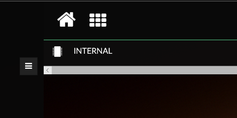 Horizontal scrollbar appears at bottom of the lists (seems to be all list views). Has no function.
When there is a long list, the side slider in the scrollbar is hidden under the top bar, only appears after rolling the mouse scrollwheel down.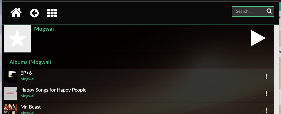

When clicking on an item in a list (e.g. artist name in ‘Artists’) the following screen opens with the vertical scrollbar in the same position (e.g. open an artist at the top of the list, the artist page opens showing the 'play button and the albums. open an artist lower in the list, the artist page opens halfway down in the tracks listing so you must scroll up to see the play button and the albums)
However, hitting the back arrow from an artist page brings you back to the top of the artists list rather than back to the selected artist. In this case it would be better to keep the previous scroll position.
Personal view: I find the bottom control bar ugly. For radios it is ok. but for library tracks I find the mismatch between the progress bar and volume bar to be jarring
 I really like the classic Volumio player with the two circular controls. Good UI design in that the main screen area is used for the primary purpose of controlling the player. This tiny bar at the bottom wastes 90% of screen.
I like where Volumio is heading!
One bug in the last version: restart does not work and I need to unplug. At least one of the times it never came back and I was forced do flash the card again.
I hear the startup sound but can never conect, neither on the PC browser or the iPhone app.
EDIT: after disconecting an external card reader where I store some local music files it restarted normaly.
I’m using Windows 10.0.18362 and Firefox 68.0.1 and a Pi3 with Allo Boss.
I also couldn’t find the settings link or access a scroll bar for the new left menu. I did find if I reduced my screen to 80% zoom, I had access to the full menu and could then do a proper shutdown as long as my browser window was at full size. Suggestion: How about a shutdown icon on the main screen so we don’t need to dig through the menu? Maybe we could click on the Volumio logo in the upper left corner and get shutdown/restart options to avoid using extra screen space?
I notice that pop up boxes at the top of the screen immediately under the green divider line hide behind the top menu bar. For Instance, when I click on Music Library - the pop up box for the first storage option is mostly hidden. The 3 dots icon pops a box open above my line position - but being the top line it hides
Other requests:
*Could we have check boxes to delete multiple items from the queue at one time?
*I have defined the directory path for my one and only NAS drive, but for some reason I need to drill down from NAS to NAS Music to the directories below that every time I choose Music Library. It would be great if it would open the NAS Music directory for me if I don’t have multiple sources defined.
Thanks for a great product.
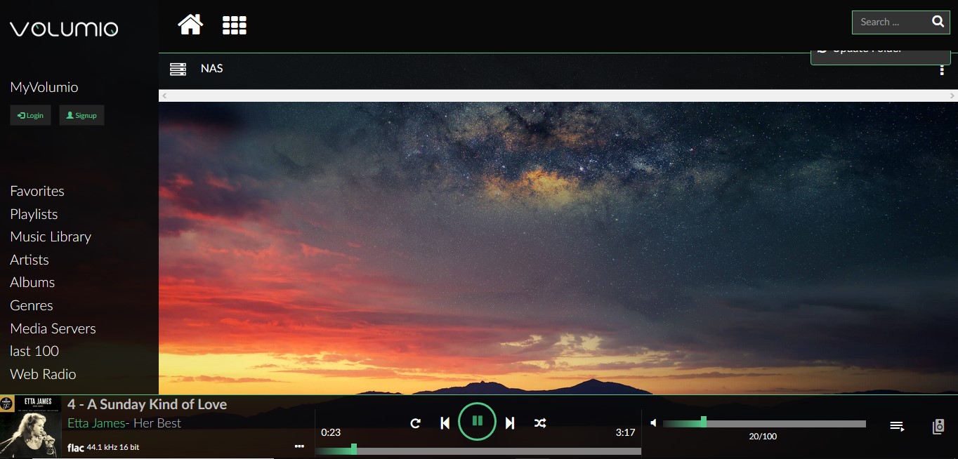
The mismatch is hurting eyes, some suggestions for that:
How about adding a button which minimizes the bottom bar when one likes that?
In new 3.0 GUI, Left hand pane for music sources does not have the vertical scrollbar. Due to this “Settings”, “plugins” cannot be see and reached.
i could see those link after reducing the zoom ( chrome browser)
DNS doesn’t work for me, I have to get to all my devices via IP.
WOW !
I really like a clean Italian minimalist design and basically it’s really good. I have only a couple of doubts.
- Full size player:
Left hand menu is good but make it scrollable and add “Queue” and “Outputs”, maybe also add “Shutdown”, all for easy access.
Make the My Volumio icon more visible ( = MyVolumio)
Main window/ Bottom player (Very much Spotify look a like  )
)
A bit like “butter on butter” , messy, dubble info /controls
( IMO the “Circular controls” can go , like a main window more like the Tablet size player)
- Tablet/Mobile size player
 Totaly blinded by a clean and nice layout, works and looks really nice.
The layout is so clean that I think that we can afford a Volumio loggo somewhere
The only thing is that I sometimes missing is a Queue botton in the Browse menus (instead of a Browse botton)

