Settings -> Plugins is missing the back button.
It’s available in all other settings screens and If I enter the settings of an installed plugin, the back button is again present.
Settings -> Plugins is missing the back button.
It’s available in all other settings screens and If I enter the settings of an installed plugin, the back button is again present.
great work!
I’m more than happy to test and give feedback needed.
This may be Radio Paradise issues and not Volumio 3 UI:
Having Volumio app on a tablet and also on the PC browser both open, if I open and edit the Radio Paradise settings on one device, the “Configuration saved successfully” dialog opens on both devices and need to be closed on both devices.
On Radio Paradise if I open the “…” menu and click on “Go to artist” or “Go to album”, the album art and artist, álbum and track names disapear. The only way to get them back seams to be chosing some other source and then go back to Radio Paradise.
firstly well done for the hard work.
The interface on a mobile device is much improved and formats nicely, having large album art looks good in portrait. I have a 4" touchscreen on my case and landscape formatting is not as good. The album art is too small with large areas of empty space. The landscape mobile formatting needs revising.
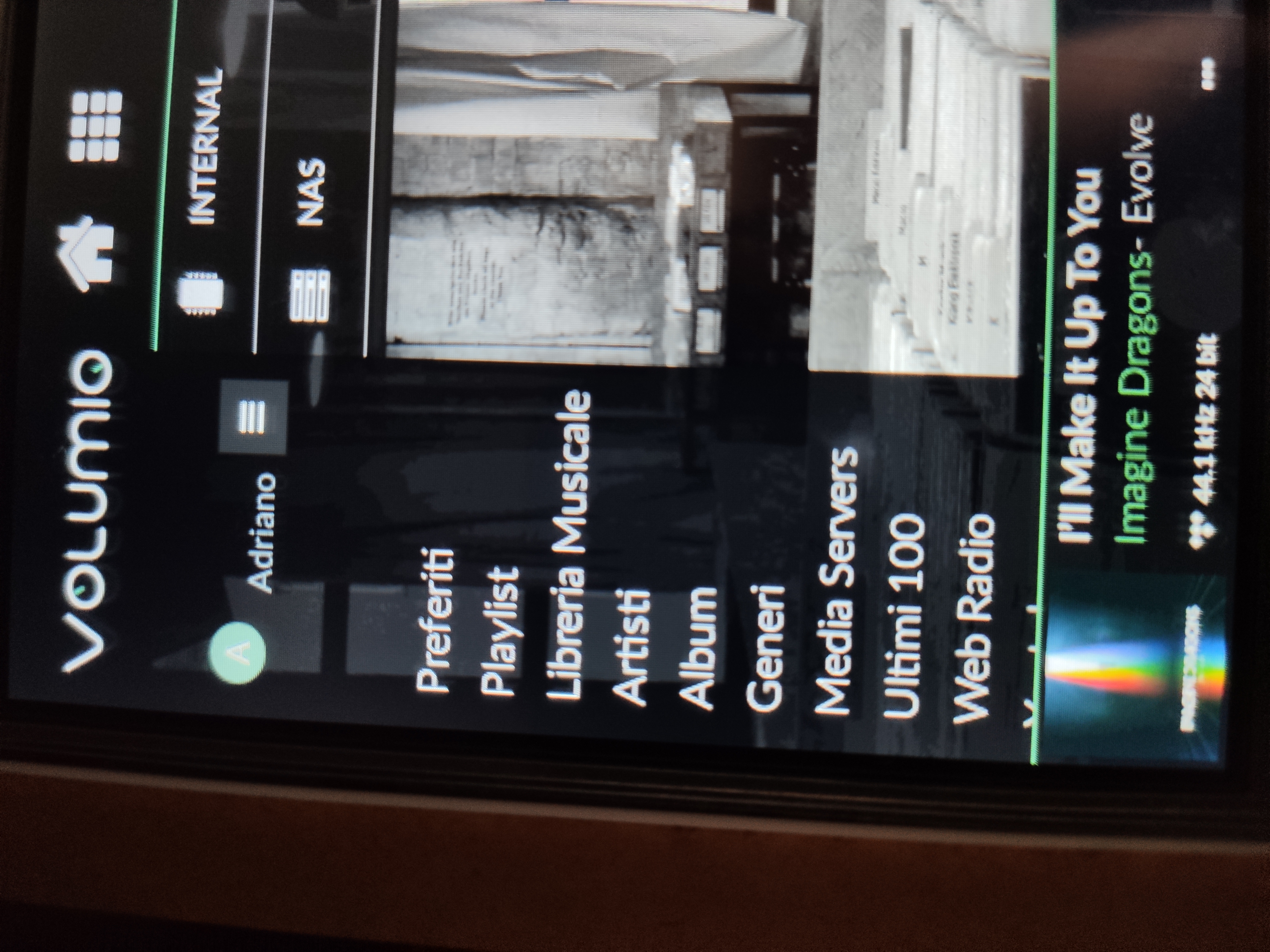
On my laptop the side bar does not show all menu items and is missing a scroll bar.
I noted quite a few people commented they liked volumios current style with the big dials. Personally i never use the dials so they are just clutter for me. I like a minimal look with maximized cover art with forward/ back buttons similar to logitech squeezebox I would make the point that you will never get a UI that everyone likes so maybe make it customizable so that you have a number of skins?
Keep up good work
I have my own 4" touchscreen on my case and the mobile
Version 2.599 - main menu is still not fully functional; except Edge.
I have to admit I find it difficult to find my way round the ‘workflow’ of the new UI. Example: I start Volumio on a mobile and I have the last track played, and useful controls (scroll bar, back/forward, etc. I choose to check whether the new CDs I just added have gone onto the Volumio library and select the cog icon. The Settings menu appears, and I select My Music. I check what’s going on and want to return to the first screen; unsure as to what gets me back, I select the ♪ icon, and now I’m in a closed loop. Nothing I select gets me out of the ‘innards’ area; the ‘home’ symbol just takes me back to that area, not the outside of Volumio. Yes, I still have the miniplayer controls, but I would like to get back to the top/outside of Volumio.
It could be that I’m so used to the old way of doing things that I can’t make sense of the new one, but there’s some standard heuristics missing. Don’t get me wrong, this is a good step forward but it seems unfinished.
I would like to thank you for the good work and for being forward thinking, and I like the new UI. I mainly run it on a tablet, and have found no problems in navigating my way around; I have found however that whether it is in landscape or portrait view does change how much is seen from the main menu, and I don’t know if this is fixable, maybe with a scrollbar as has already been suggested… A feature I like and which I don’t know if it’s intentional is that a ‘swipe down’ refresh presents me with the nice ‘now playing’ view screen with the album art. What I would like though is for the playback resolution info to be displayed somewhere as I’m that sort of guy with that sort of system, and unless I’ve changed the id tags for the album name to reflect this sometimes I don’t know what it is… also nice to have for internet radio playback. Many thanks again and Ciao!
… Just did some more fiddling and really the menu etc is only properly visible and easily usable in landscape, and the ‘now playing’ screen that I’m seeing looks like it is in fact the round controls screen but with only the central bit visible in portrait. I’m running Chrome on a Samsung tablet. Cheers/Ciao!
… And the res info is in fact visible in landscape so it’s all a landscape/portrait issue for me … really nice in fact in landscape including with the old style dials ‘swipe’ option… Cheers/Ciao!
Although it is not as clean as the previous, it is still very nice upgrade from the previous one. Thanks for the development.
One thing. Is there any fast way to turn off the system? As I use mobile phone for controlling the system, I have to first click two times, scroll down and again click two times.
Thanks
Is there a way to get to the ‘settings’ via the WebUI? I cannot find a way t navigate to a place where I can add/edit my NAS settings, nor to check for updates. Perhaps I’m just not finding it.
Also, is there a github project for this new UI?
It should be on the left pane, bellow the music sources. Try reducing the zoom on your browser.
Thanks, I can see the settings link now when I zoom out. Running on a 13" laptop screen and so some things are disappearing from the view.
Overall, I should say that I do like the new UI. Seems like it will be a noticeable improvement. Thanks for the hard work.
Next update will be interesting according to this  github.com/volumio/Volumio2-UI/commits/master Don’t know are these in production version yet, but lots of bugfixes and improvements are coming.
Great prospects!
Still, for me with Allo Boss, the most important thing is fluent Spotify integration. Just because I listen to it that much. Number one would be: to see and use My Playlists. Now I can’t. Also the folder structure inside lists does not open at all (e.g. “Genres & Moods”).
A
Please keep the current (older) UI still selectable in the future even if not as default. I understand the reasons to switch to a more “common” interface, but I got accustomed to the 2 circles (track and volume) and find these really handy on my tablet to use. Way more comfortable to jump to a specific point using the circle vs the bar where it feels less precise IMHO. It might have to do also because of the size change, sure but the disc mode feel still more precise when wanting to jump to 1/4 etc. Also I don’t mind to use the 3 “tab” views (at the bottom of the screen) but have bigger elements shown. And to finish, I feel also the menu on the left takes way too much space away.
The moment that you have to repeat a specific touch because your tip of the finger feels less precise in pointing to a specific command, then you have a big problem in usability. And I am on a standard ipad size screen. Willing to sacrifice this in a smaller phone screen. My 2 cents. Thanks!
Estheticly I like the 2 versions but in my opinion the first UI was more easy to use with a little screen(5" in my case) as Astaroth2k said. Aside from that I think it would be interesting to have access to “settings” from the main page. For example, at this moment you have to go to the queue or to the menu button(on top of screen with mobile UI) to have access to settings and then you can quit volumio. It’s not that I’m lazy but I find it rather tedious to just turn off the player.
My volume can only be adjusted in steps of 5. Is this intentional ? Or a bug ? Or something I have to change in the confguration ? (In the Settings/Volume Options, I have One Click Volume Steps set to 1. But that did not help.
Also, when I select the pane with the 2 circles, for time-played and volume (with the album cover in the middle), I used to be able to change the volume by clicking on the right circle (the volume circle). That does not work anymore. The bar at the bottom of the screen does allow me to change the volume (but again, only in steps of 5, not 1). Also, under the volume-circle there are 3 icons. Volume Down, Mute and Volume Up. Mute works. But the Volume Down and Volume Up don’t work properly. Down often works, but not always. Up sometimes works, but most of the time it doesn’t. Weird.
Using the left circle, to adjust where you are in the song, does not work at all.
(I’m using Firefox on Windows and Android, and Internet Explorer on Windows).
I would like to have the selected playback zone displayed on the main screen.
You can get Spotify working with the following patch:
Hi,
i have switched to the volumio 3 interface, except from phone/tablet i am controlling volumio with a 7 inch waveshare screen. With the screen the left menu bar doesn’t show all items and it is not scrollable.
I have patience to wait main distro. Don’t want to fix after any system update. I have now both installed and active. Why? Because it works both with Spotify and Volumio UI. Otherwise not.
But thanks anyway. Hope you get that release soon.