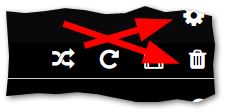
Could anyone please suggest how I could visually separate/ create more distance between the Setting icon/button and the queue Delete icon/button? With a small touch screen and a fat finger it is so so easy to accidentally tap the Delete button (and loose all the carefully collected items in the queue, mainly web radio stations), instead of tapping the Settings button. There must be a screen layout file somewhere I can hack in between system updates.
Maybe there could be a confirmation message box before the queue is deleted?
The following should be a separate top but I’m lazy - if you add web radios to a playlist, then from browse, add that playlist to the queue, the queue items are named “undefined” rather than their proper name. So, this is no workaround for my main question sorry.
Thanks for any help.