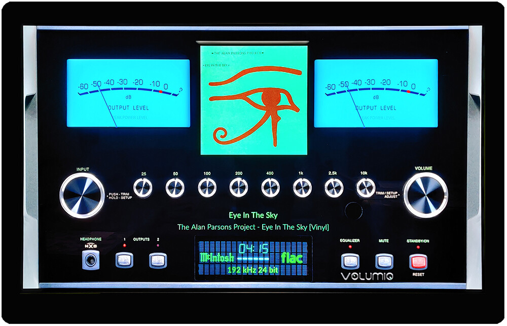
Mcintosh 1920x1080 skin
#-----------------------01 MCINTOSH ---------------------------
[Gelo5_McIntosh]
meter.type = circular - Leverage indicators
channels = 2 - number of channels
ui.refresh.period = 0.033 - we don’t move
bgr.filename = Mcintosh_vu.png
fgr.filename = Mcintosh_frg.png
indicator.filename = Mcintosh_needle.png
steps.per.degree = 4 - we don’t move
start.angle = 41
stop.angle = -41
distance = 207
left.origin.x = 380
left.origin.y = 460
right.origin.x = 1420
right.origin.y = 460
meter.x = 60
meter.y = 60
screen.bgr = Mcintosh.jpg
1.First, specify what resolution you will set (on the example of a 1920x1080 skin)
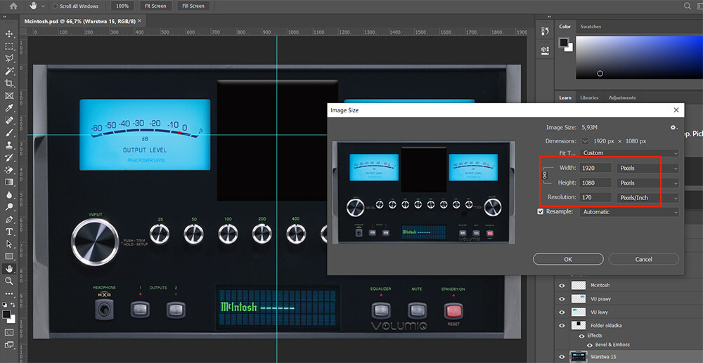
2.Select a photo and place it at the specified resolution (here 1920x1080).
a/width 1920px
b/height 1080px
c/resolution 170 dpi (170px/inch)
3.Save as .jpg - this will be our:
screen.bgr = Mcintosh.jpg
4.Open the Mcintosh.jpg image and replace it with .png (with transparency).
Now we create the background for the indicators
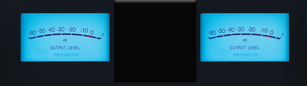
5.Save as .png - this will be our:
bgr.filename = Mcintosh_vu.png
6.Placing the background under the indicators:
meter.x = 60
meter.y = 60
Attention! if we work on the whole area (1920x1080) and make the background for the indicators like this:
The image will be aligned to the upper left corner (This is the easiest way) and:
meter.x = 0
meter.y = 0
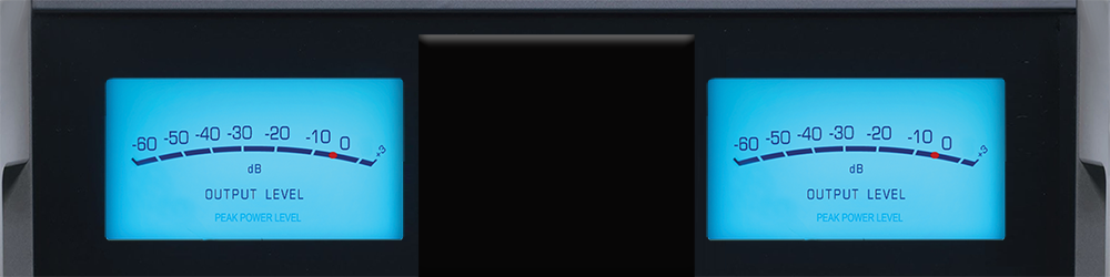
7.We cover unnecessary elements on the background of indicators.
The indicators will be covered and not visible on this part

Save as .png - this will be our:
fgr.filename = Mcintosh_frg.png
8.All that’s left to do is pointers. We save it as .png - this will be our:
indicator.filename = Mcintosh_needle.png
9.We specify the distance from the left side of our pointers (here: 380 and 1420 pixels - to the center of the scale)
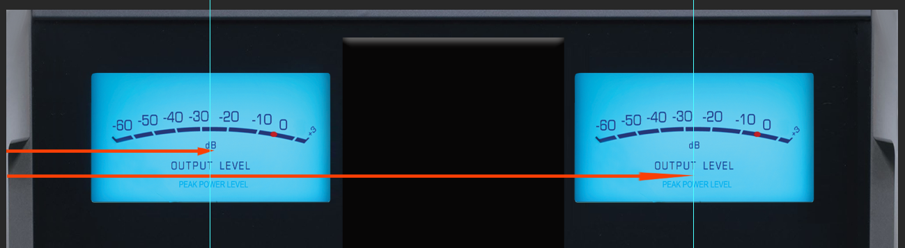
left.origin.x = 380
right.origin.x = 1420
10.We determine (from the top) where the end of our arrow is.
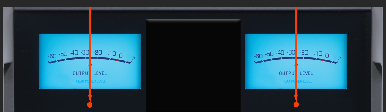
In a landscape layout, left and right should be the same
left.origin.y = 460
right.origin.y = 460
11. We specify the angles in which to move with the arrows.
Start - plus
Stop - minus
start.angle = 41
stop.angle = -41
The rest is described in the WIKI
Now we can check how our indicators work (without additional descriptions, covers, etc…).
Of course, at the beginning we only give the entry as above
Now we add additional elements to our skin
— volumio optional entries -------
config.extend = True
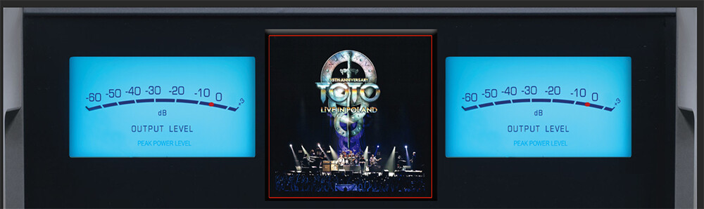
albumart.pos = 740,80
albumart.dimension = 450,450
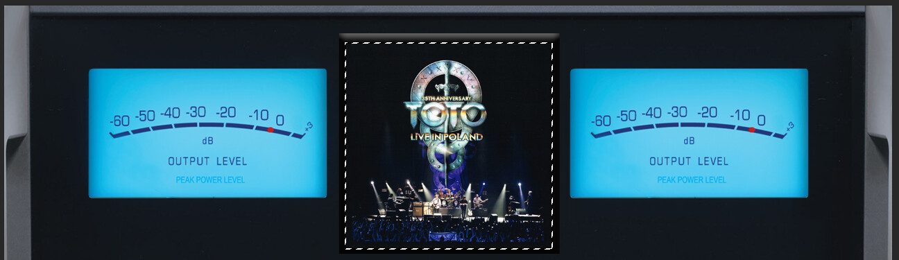
albumart.border = 1
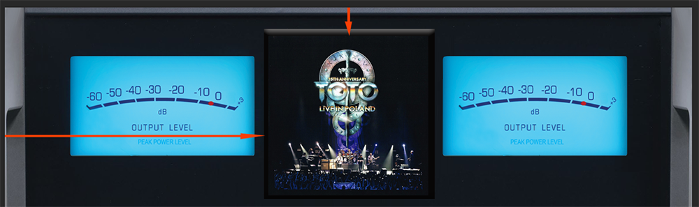
albumart.pos = 740,80
740 pixels from left
80 pixels from top
albumart.dimension = 450,450
The size of the cover in pixels
albumart.border = 1
Border around the album: 1 pixel. There may be more, e.g. 2, 3 pixels. The border color is the same as the text color. If you don’t want a border - put “#” at the beginning before the whole line
#albumart.border = 1
playinfo.type.pos = 1080,910
playinfo.type.color = 0,177,64
playinfo.type.dimension = 90,90
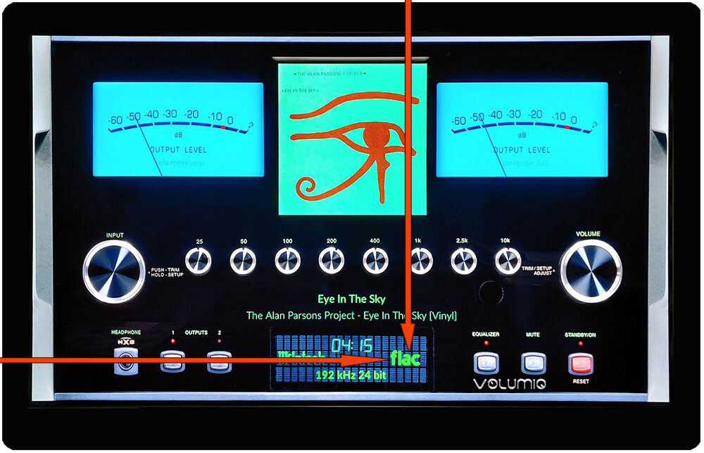
playinfo.type.pos = 1080,910
1080 pixels from left
910 pixels from top
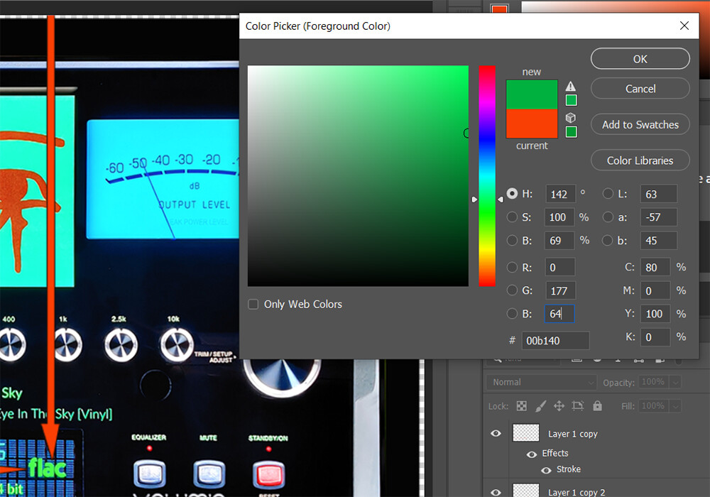
playinfo.type.color = 0,177,64
RGB
playinfo.type.dimension = 90,90
The size in pixels of the file type (90x90)
time.remaining.pos = 900,900
time.remaining.color = 67,194,139
font.size.digi = 37
time.remaining.pos = 900,900
900 pixels from left
900 pixels from top
time.remaining.color = 67,194,139
Same as above
font.size.digi = 37
The DIGI font is responsible for the passing time. Its size is set in pixels (37)
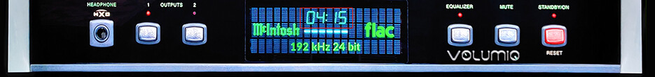
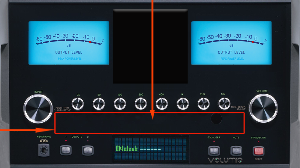
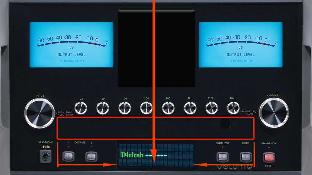
playinfo.maxwidth = 1200
playinfo.center = True
We define where the information about the artist, song, album will be
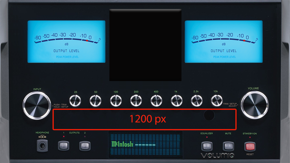
playinfo.maxwidth = 1200
Here this size is 1200 pixels
playinfo.center = True
Specify whether the text will start from the left (frame) or in the center of the frame
True = center
False = from the left
playinfo.title.pos = 362,760,regular
Placement of the song title:
362 pixels from left
760 pixels from top
regular=font type
playinfo.artist.pos = 362,810,light
Placement of the artist:
362 pixels from left
810 pixels from top
light=font type
Attention! If there is ONLY: playinfo.artist.pos - ARTIST+ALBUM will be displayed
If we want to separate the artist and the album - we have to enter:
#playinfo.album.pos = 365,940,light —> playinfo.album.pos = 365,940,light
playinfo.samplerate.pos = 360,985,bold
In this case it’s simple - because the samplerate is centered like Artist, Album and Title
Placement of the samplerate:
360* pixels from left (In the middle of the selected box 1200px)
*If we want to shift to the left - we decrease this value, which can also be “-”
If to the right - we increase this value
985 pixels from top
The samplerate color is the same as the type color
font.size.light = 30
font.size.regular = 32
font.size.bold = 32
font.color = 0,177,64