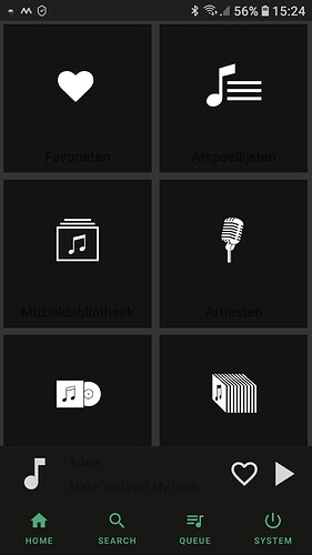
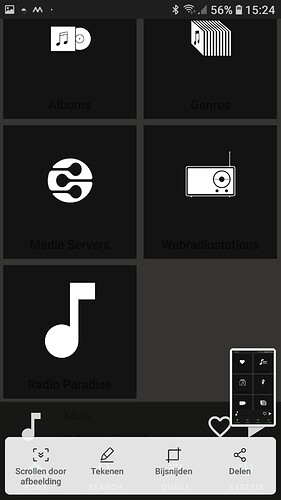
What’s the bèta App called, I can only find the “old” Volumio App in the Android App store?
There is no old and new application in that sense, this is no official volumio application, it’s from member of the community to the community.
It’s currently not publicly downloadable from playstore due to delays in Google preview process because of the pandemic.
If you want the you can download the .APK file containing the application from my last post, just above your post while we wait google to get the review done.
Hi Joni
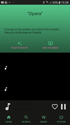
Just downloaded and installed it. It does not look at alle like the preview bitmaps you showed above. Looks like you made major changes. If you like I could upload screenshots?
Edwin
Yes please.
there is some color changes etc from the point of when the pictures was taken, and if it looks completely different, are you using phone to test it? For phones the UI does look different and is locked to portrait mode, the screenshot’s are from big tablet device when there was no support for smaller screen sizes.
Taking a look at this, testing on an LG G7 that I just wiped and intend to use for a media only device.
- Installed correctly and found my Volumio system
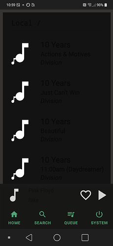
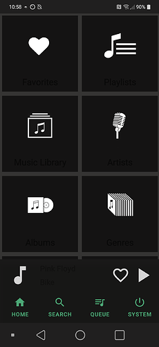
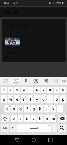
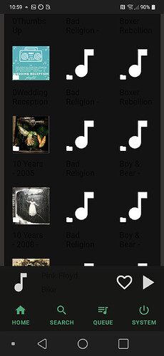
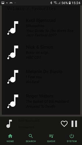
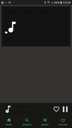
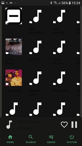
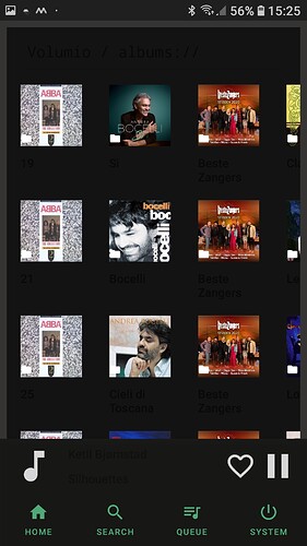
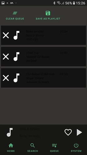
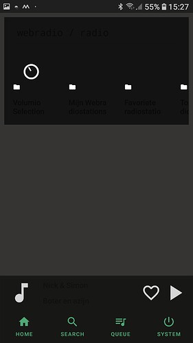
- Color scheme is all wrong - I am seeing white icons but text is all dark, same as background
Couldn’t really go any further - clicking found songs and albums don’t seem to do anything but it could be that I am missing some detail or instructions due to lack of being able to see the text.
Hey, could you post a screen shot or couple? I’m just in middle of fixing couple more bugs and could look into that.
I see, i assume you use “light system theme” on your device? i have forgotten to override light theme in the application it seems, i will fix that aswell for the next version.
This is just all default for this phone as I just wiped it. All other apps seem to look OK in this regard.
Yes, its because usually developer of the app either override both dark and light theme, and provide just one theme for the application, or design the UI so that it works with both and correctly changes backround colors when text color changes, Its something google calls as “day and night” mode, its rather new feature.
it seems i have not done either one yet 
As an status update.
I’m currently investigating alternative solution for the horizontally scrolling list views, i will at first atleast leave it as horizontally scrolling aswell, but also provide an button to expand the list view to vertically scrolling grid, so we can focus on one section of the list items at time, i believe this is win-win situation if you liked the horizontal scrolling items.
In the same time, i do improve the the usability on different screen sizes, and do not use hard coded image sizes anymore, instead it’s calculated runtime to always fit same amount of items in the screen regardless of the actual screen size.
Playlist management will also be in there, so you can add and remove items aswell as create new playlists.(webradio favourites is not included yet)
And of course multiple small and bigger bug fixes, which should itself give better user experiement.
Next version should be out by the end of week if everything goes well and I have some free time for it.
Google finally got the review done so it’s not live on beta testing on Google play store, from now on i will push application updates directly in there.
Is these screenshots from the version downloaded from playstore? It should have that proplem fixed, there is link in first post now for that  (but well, i might be wrong and the issue is still in there for some handsets)
Those color issue’s was/are caused by the fact that i forgot to override light system theme, internally my app uses something called “daynight theme”, which makes it so that it tries to adapt to your handset system theme(light/dark == day/night), but i never provided my custom styles if the “light system theme” is in use.
Thx for taking the time to test the application! I will investigate if i can reproduce this with some of my test devices.
[Update]
Favourite track handling is implemented now, i decided to bring to local media, spotify, tidal and qobuz Favourite tracks all under the “Favorites”(will implement webradios there aswell later on), which is different behaviour than what Volumio web browser gives and might be bit confusing for some.
You can still find tidal and qobuz favourites where you have used to find those always.
some small fixes here and there aswell.
Any update for the Playstore version?
Thanks in advance
I think it was 20th day of the month i put last update fixing various crash issues/bugs if that’s what you mean. If for reason or another it does not auto update i suggest to uninstall and then reinstall, i think one of my developement devices acted like that for uknown reason.
Currently I’m working on to improve the favourite track handling a bit, and also adding full control over the playlists you create on volumio, also wondering, if i should also show tidal/qobuz/Spotify playlists on the playlist section all in one place, just like with favourite tracks, when navigating from the main screen to “Favourites” section.
Also there is huge refactoring process going under the hood of the application, to ease the maintenance job of the app later.
I have been quite busy on my day job and was working also the last two weekends so this have slowed me a bit with this application.
I hope i find some time this weekend to provide update with the stuff above.
Just pushed an update which should now fix an issue that was there for long time, if you had “light” system theme on your device it would make it crash instantly, because i did implement the forcing of dark theme for the application incorrectly, thx for Vennesch to pointing me out the issue, which i was not apply to reproduce on my developement devices.(this only affected some devices, not all)
App can now be used in either landscape or portrait mode for both tablets and phones and should scale more better for different size’s of devices, there are still some minor issue’s with that on some of the app screens, but i try to sort those out for next version.
Performance is now better when browsing music sources on screens where there was long list of tracks with other content, because it’s now only showing 6 tracks max, and rest can be seen when the group is expanded.
When expanding a group of tracks, UI does now properly behave instead of showing a mess.
Also I can see couple of odd crashes from Google’s developer console occuring on some Samsung devices mainly, which i cannot reproduce on my devices, it would be great if the affected user(s) could tell me what happens and most importantly when it happens, so i can try to fix it.
This looks really nice, I’ve downloaded it from Google Play and it attached to one of my three Volumio players. The problem is that I could find no way to display which of the three I had attached to. Also, would it be possible to switch between the players? I have one in my study, one on my main stereo system and one on my headphone system.
Thanks for your good work.
Mark Gosdin
Hi,
Currently it’s connecting to first of your devices which it happens to find.(or to be correct first device that does give back a response that it’s indeed a volumio device, when the application scans your local area network devices)
Sure i can implement it so that it does show the connected device, and ability to switch between the devices. This has been on my to-do list, but since i currently only have one volumio device myself it was not top priority feature. Can do it for next version aswell.
