I had something very similar in my mind, there is not too many options on how to implement it, so that it would be battery friendly.
But that is in the list after series of bug fixes, besides i still haven’t implemented the options page for the app which need to be in there before this kind of stuff, so that one can opt-out from these possible battery inefficient options.
The official app would be great if it got working navigation with the native back button of the OS, without that i just find it unusable, because i can’t stop pressing the back button when i want to navigate back. This same goes to the web browser interface, which is a reason im thinking about creating windows client software aswell, if i happen to find time for that.
I believe that all the current client apps for volumio do have their own pro’s and con’s, none of the apps is the “way to go” for all users, and it’s up to personal preference which one you decide to use.
(let’s not make this official vs this app or any other discussion)
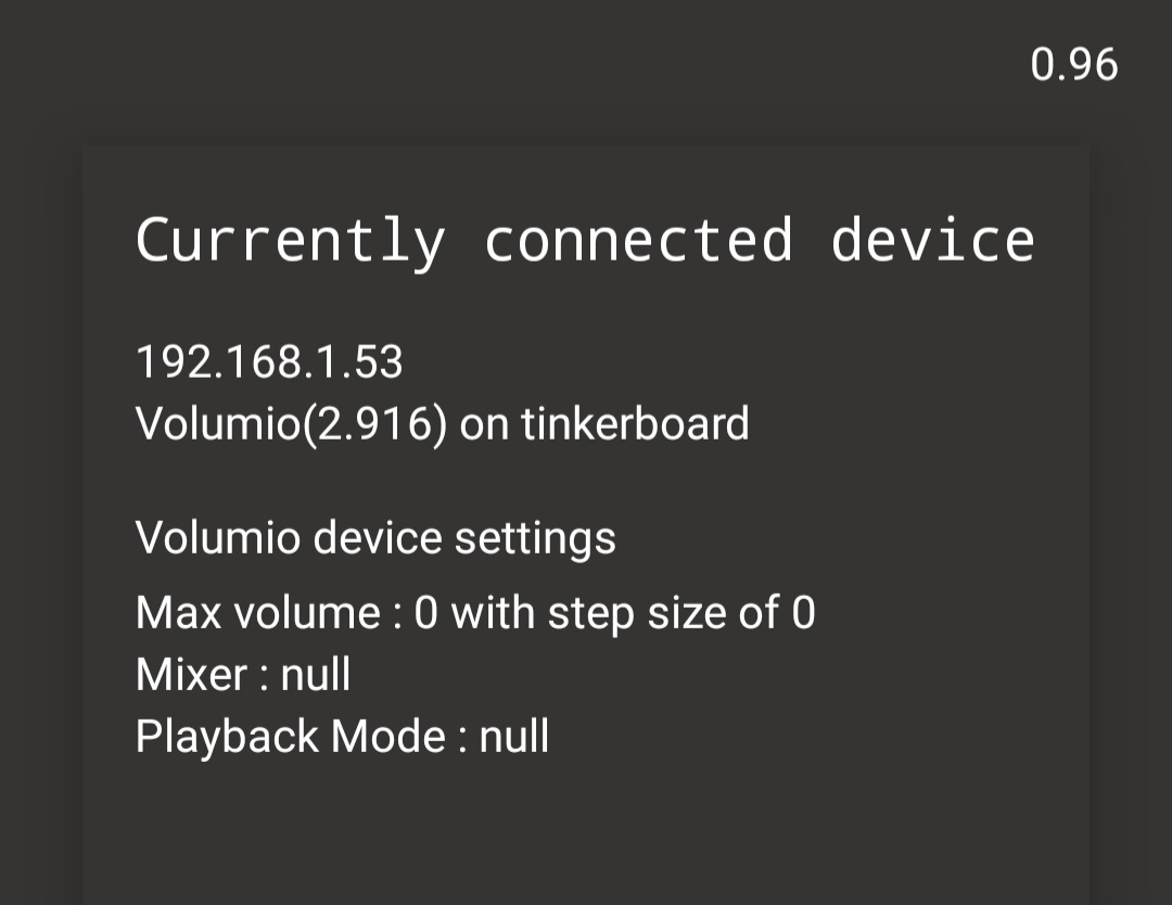
Not an issue for me because the app is so blazingly fast in connecting. Would be nice though to be able to set a default IP for connecting (for when you only got one box)
I add that option back for the next version, it was there already but at some point changing the UI, i believe i forgot to put it back. (It’s actually implemented so that it will connect to first device it finds without need to enter default IP address, this will allow the option to work even if the volumio does have dynamic IP address which could chance at any point)
Some stuff for next update is.
-increased the gesture area for portrait user.
-fixed UI bug on back navigation(it was flashing error/loading screen very briefly)
-all the dialogs changed to “bottom sheet dialogs”, so these will come from bottom of the screen for better usability on portrait mode.
-local playlist stuff fixed.
-bring auto connect option back.
-make the retry button work on error screens.
-and probably many more tweaks i forget about.
Last update seemed to cause some serious state restoration proplem’s when coming back to the app when it was killed, many of you propably did see the empty “music service” list in the home screen, i’m sorry for that.(for time being force closing the app fixes this, and propably using the device switching functionality aswell)
I believe i found a cure for that, and at the same time fixed one similar bug which did happen from time to time since version 1 of the app, the fix was actually so obvious that i feel bit stupid right now.
So basically the fix was to force checking the socket connecting status from the socket object itself, instead of relying the cached state , and since the first very first thing the app does when it launches is to start listening this event, it should now always receive a state which it can safely use determinate what it should do.(before the state could be restored somewhere in between connected and disconnected, which in rare occasion was false state and we got stuck)
i will try to do my best on testing bit more and release the update today later.
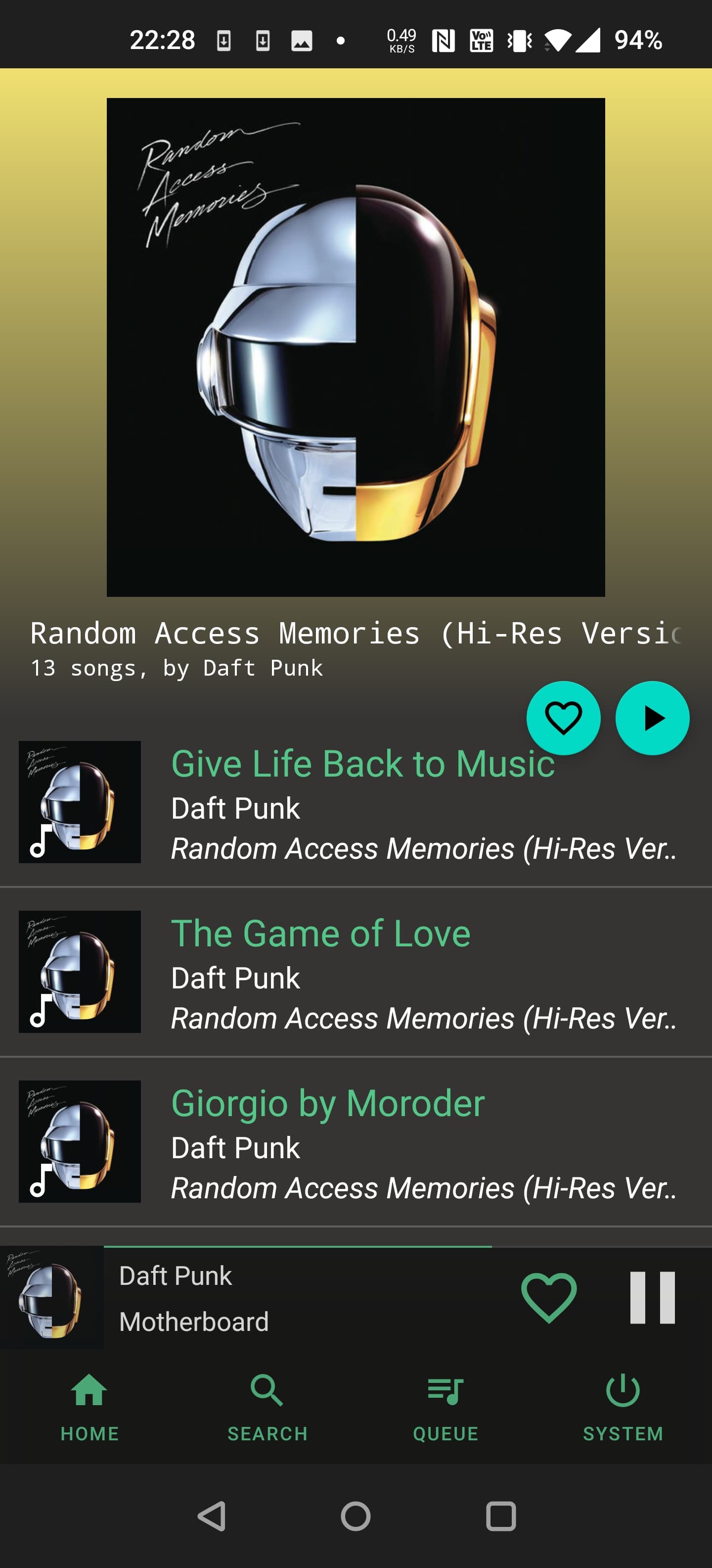
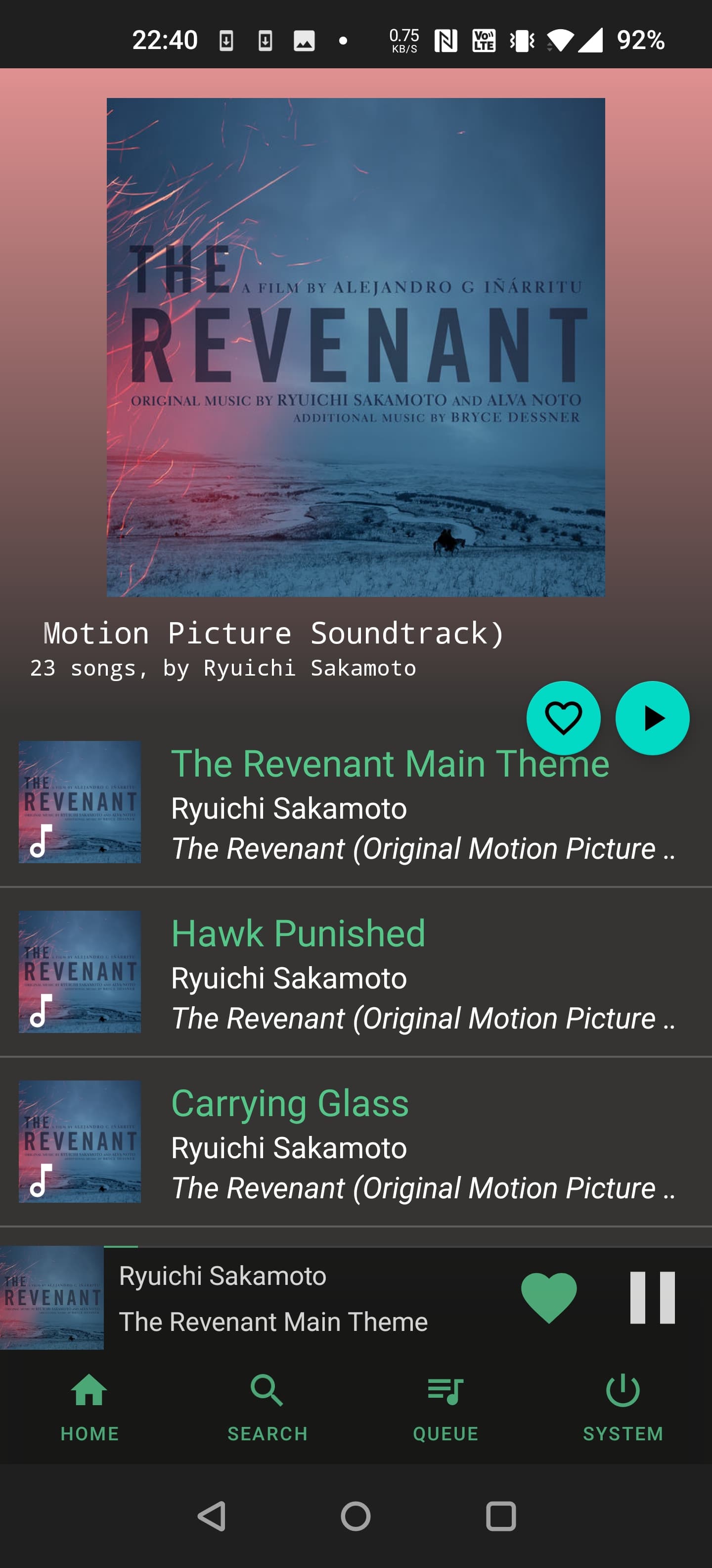
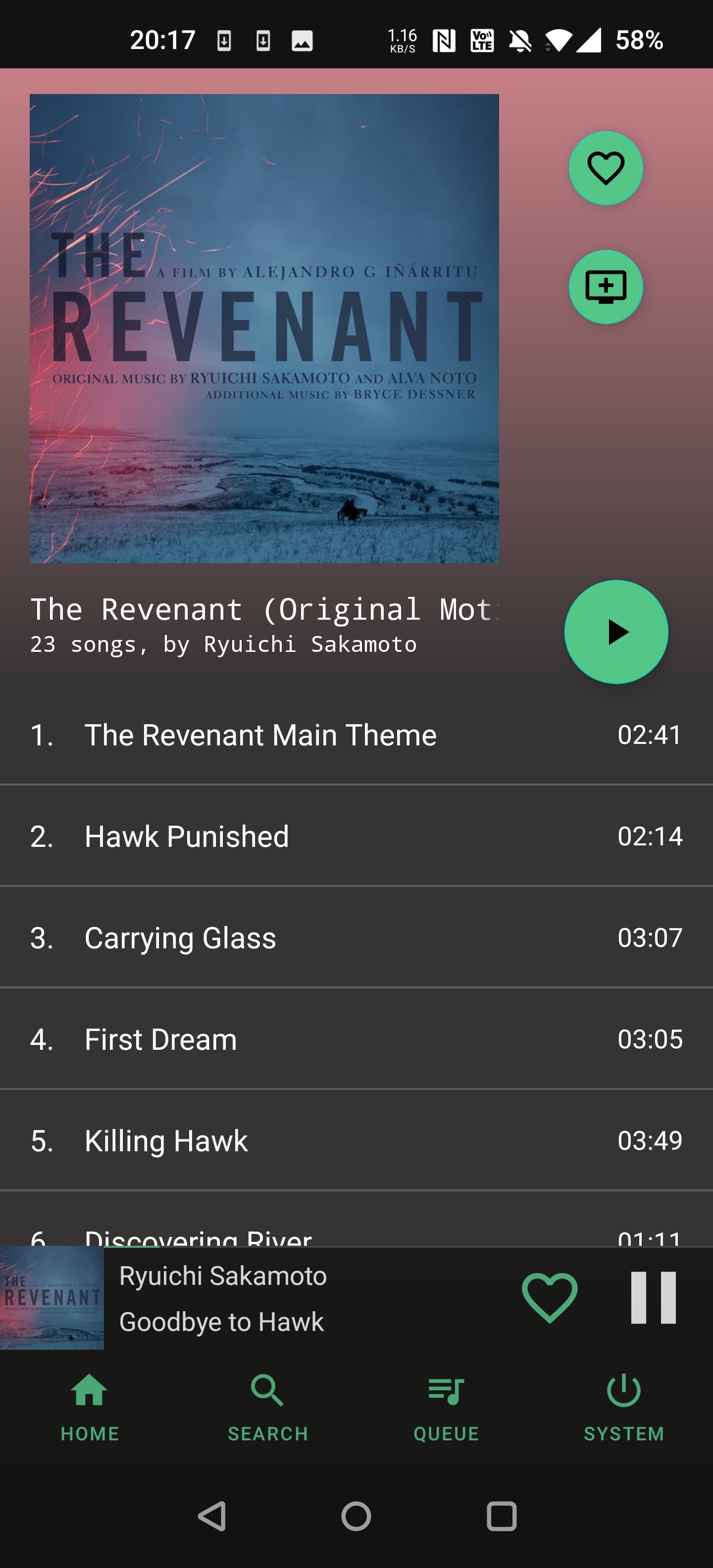
The top gradient color is dynamically selected from the albumart and then blends to the background color, this makes the color bit different for all the albums, so it’s not so boring.(Spotify app does the same i think)
Also the album name scrolls once when the view is opened, if it’s too long to fit on the screen.
Not at the album screen, but also added song progress indicator between the bottom action bar and content.(it is not possible to fast forward etc from that, because it’s too close to other clickable content, and would cause missclicks)*only for portrait currently.
UI rework has been in my mind for long time already, but its slow like a lot slower than writing some new feature or so, because i have to account for all the different screen sizes best i can.(most of the screens in the app only have 2 layouts, portrait and landscape which then scales on different screen sizes)
And then the variety of android versions in the mix…
I’m daily trying to make some progress with the app, but most of days i have only hour or so time available for that, which is not much at all and even i feel like no progress is happening.
Removed all the stuff that kept repeating itself, which makes it more clean and nice overall in my opinion, also experimenting with different action button placements.
Personally, I like the tracklist background colour being a transition between the gradient and the stark solid black of the controls background, but things like this will come down to subjective taste.
I believe this is what i will settle with for now, hope someone else also finds it better than what it was before, open to any feedback. (Still need to refresh the other views with same/similar look)
Currently it’s looking for “light vibrant” color from the art, if it does not find one it fallbacks to black color and build the top gradient based on that.(you need max brightness in screen to see that one)
I was thinking about making the fallback color user adjustable, to give some customisation options, or then look for dark variant of the color if the light one is not present, but i don’t know which is better in the end, perhaps just give both options in the end?
For the next update i was planning of implementing
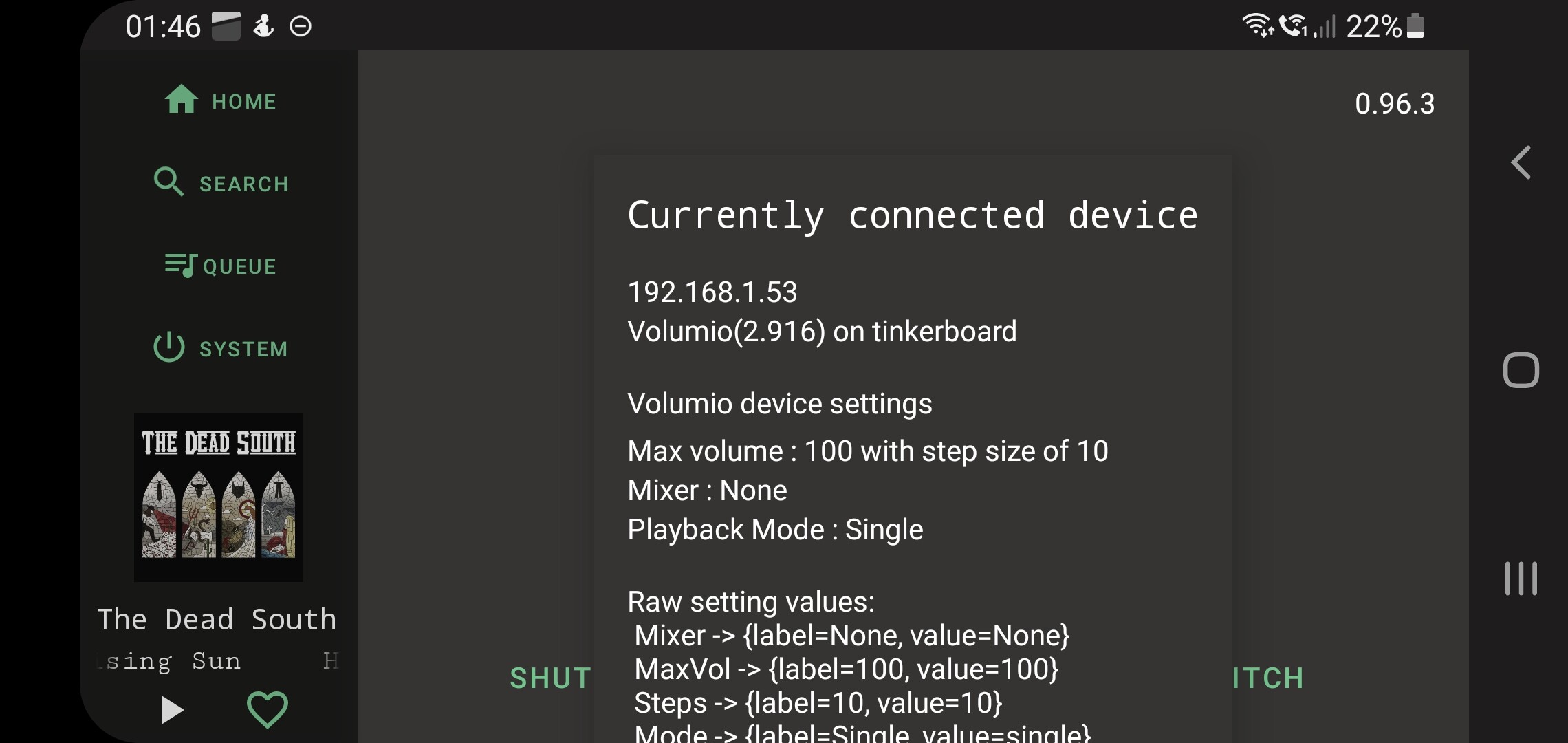
Need to fix that aswell, or more like remove it all together and add another kind of indication that settings was retrieved and smaller indication of the currently connected device.
Thx for reports!
Any feedback is very welcome, let’s try to make it ready for first non-beta build by the time of volumio3 launch, after that all the builds will go throught the beta stage and then to production when i see it working.

 , and since the first very first thing the app does when it launches is to start listening this event, it should now always receive a state which it can safely use determinate what it should do.(before the state could be restored somewhere in between connected and disconnected, which in rare occasion was false state and we got stuck)